Revamped Kiwix Serve Welcome page layout #559
Conversation
Codecov Report
@@            Coverage Diff             @@
##           master     #559      +/-   ##
==========================================
- Coverage   64.92%   62.07%   -2.86%
==========================================
  Files          53       53
  Lines        3738     3388     -350
  Branches     1881     1881
==========================================
- Hits         2427     2103     -324
+ Misses       1309     1282      -27
- Partials        2        3       +1
Continue to review full report at Codecov.
|

e664b2c to
0462c6b
Compare
There was a problem hiding this comment.
Lets go with the review:
- The "Download" button should point to the ZIM file (to download), not the the demonstration link like today. We should have a "Download" link and a "Preview" link.
- The style of the download/preview links is not link in the mockup
- The size of the ZIM file is not displayed, it should (and it should be rounded properly)
- Each tile background should be grey, not white
- The tile in itself should not be clickable (only the "Preview" and "Download" links should be clickable).
|
@kelson42 I have updated everything except this ->
The background color is the same as that in the mock-up and I couldn't find a better color that suits the card background, If you think some other color would be better I am open to suggestions (kindly try to send some color code thx😅 ). |
|
@MananJethwani Please rebase on master an request a new review if you are so far. |
c091f58 to
26fdd64
Compare
|
@MananJethwani Can you please rebase? |
|
@kelson42 I think this PR is properly rebased. |
There was a problem hiding this comment.
Hmm, yes this is rebased ok now. sorry.
- There is no "url", then the download button should not be displayed. It makes no sense to display a "download" label with link.
- If there is no "size", nothing should be displayed ("unknown" for the moment)
- If there is a "size", it should be below the title (not like in the mockup, which is wrong in my sense).
- Whatever there is a size or not, both title (and size) should centered verticaly on the icon height
- The tile background is not right like I said earlier already (you need to verify precisely). It's
#fcfcfcand it should be#fbfbfb. - The font for "Preview" and "Download" is not the right one
- There should be no shadow, the border of the tiles should be exactly like in the mockup.
ee4a371 to
01c8230
Compare
There was a problem hiding this comment.
Looks better, but the icon size should be fixed. See:

If the favicon has the wrong size it will break the rendering. The size of the icon should be like in the mockup, and the iconv given in the zim should be scaled on the fly by the browser if necessary.
Otherwise, I think it is time now to have a look to the styling of the selec boxes.
Few other remarks:
- "reset filter" link should not include the space before and the question mark.
- "Results: 1487 items" should be printed just on the top of the tiles (so not like in the mokcup) and only be "1487 books"
- Underscore replacement in tags, only applies once. "science in_the_bath" is replace with "science_in_the_bath", it should be "science in the bath"
- Displayed tags are not matching the reality, for example for https://6c4279ae3f65.ngrok.io/scienceinthebath_en_adventures-wonders_2021-04/M/Tags, I see a value of "science_in_the_bath;_videos:yes", but this is what is displayed "science in_the_bath | videos | pictures | details". Actually, we should hide all "private" tags (starting with _). So we should see only "science in the bath".
50db2c0 to
ff1232c
Compare
There was a problem hiding this comment.
New remarks:
- If no result, the "0 books" should be hidden
- The blue-grey color of the selector shoudl be replace with
#909090 - The drop-down boxes are not styled at all. They should.
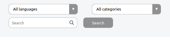
- The followin screenshot has 3 problems:

- the grey tobar height is too big
- the category button is not aligned witht the search button
- the vertical space above "12 books" is smaller than the one below (the one below should be like the one above).
- Please remove the "effect" on preview/download. Just color the background when we are over (but no filling effect).
- It is a good idea that the color is changed in the filter when a special filter is set, but it should be consistent. If I click on "reset" then all filter backgrounds should be white again.
e4f58b9 to
578025e
Compare
|
@kelson42 I have fixed everything as asked, but the dropdown list styling doesn't work in the case of firefox and I can't seem to find a proper reason for that, might need some help here, I will keep on looking, for now, please check everything else. |
|
@kelson42 regarding the misalignment of boxes please mention the exact width and height of the screen as well as the browser as when I test it on multiple screen sizes this works fine and I can't seem to have this issue, |
|
found the alignment bug it was on screen size greater than 2100px sorry for that I checked and resolved it for smaller screen size. |
|
I've quickly reviewed it. On the technical side I've nothing to say (but I no a js expert). I would like to mention #549. We start to generated all our html using custom js code and svelte is made especially for this. |
@kelson42 this fixes kiwix/kiwix-tools#448 and fixes kiwix/kiwix-tools#370
for now, I have changed the basic layout and updated the cards.